Blake Hunsicker
Designer and developer • Currently building diagram.news • On Twitter and LinkedIn
Most of my design work on the Post's native team focused on rethinking the national app, called Washington Post Select (App Store, Play Store).
Instead of sinking months of time into a single, comprehensive redesign, my product manager and I decided to tackle individual problems and push out improvements iteratively.
Onboarding
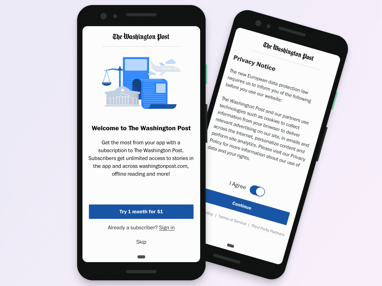
My last project at The Post was a revamp our onboarding experience. We wanted to create a new template to use for a) first time users and b) as a way to highlight new features and subscriber benefits. At launch, we called out the Post’s new Reading List, which allows users to save stories and read them offline across devices. Since I've left, I've noticed that my team have begun using the template to highlight other features they've launched.
App store marketing
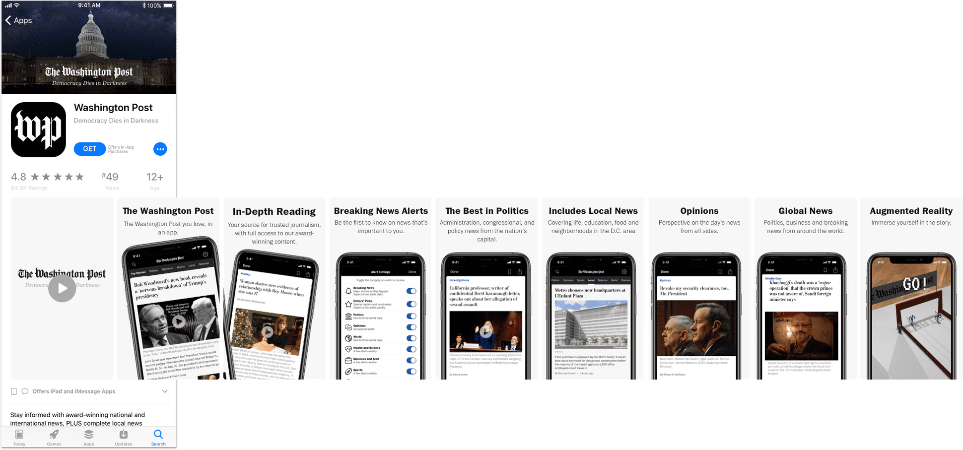
For our App Store marketing revamp, we explored what we wanted to communicate to first- and long-time users. We determined what to write in combination with our newsroom stakeholders and user research.
Rich notifications
We updated our notifications shortly after the iOS 12 rollout to include images and our house fonts on every notification we send. We also created our first interactive notifications, which we used to cover results during the 2018 Midterms. It was exciting to be among the first to make use of iOS 12's new functionality, and the Midterms seemed like an ideal opportunity to experiment with adding interactivity to our notifications.
Recirculation modules
The recirculation module is an end-of-article story carousel we launched in June, 2019. It proved to be so successful that we then launched it on our flagship app as well in October of that year. The module aims to make use of a dead end at the bottom of articles, and boost depth to sections that don't get significant traffic.
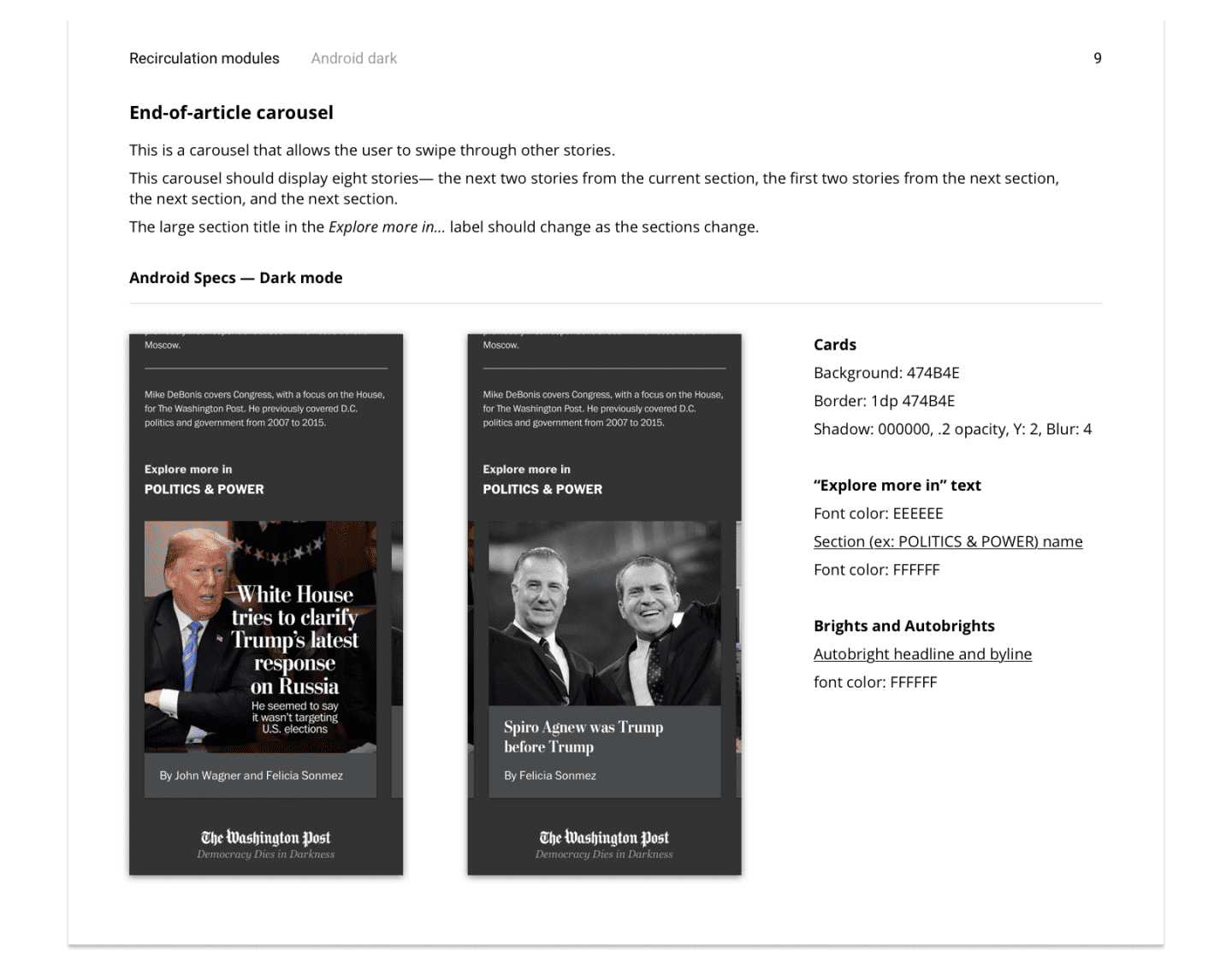
I designed several UX options before landing on a carousel, which we chose because it's a navigational pattern users recognize and would serve as a canvas for personalized recommendations. From there, I designed two versions of the carousel and made hi-fidelity prototypes in Principle. We added this feature into a larger user test we ran late last summer. Every user recognized it as a carousel (small win, but still felt good). Below is an example of spec I shared with developers:
We put a lot of thought into what stories should go into the carousel at launch. In the end, we decided to emphasize stories from other sections, hoping that would help surface stories users would otherwise not see. We launched it in October and it did very well against our KPIs.
Design system
The designs are complete, and I'm currently cleaning up Sketch symbols and styles and adding them to InVision DSM, a new design system management software that I want to use to help centralize the main design components for this app, as well as the colors, font styles, and spacing to keep things uniform.